Frequently Asked Questions
How to get MailChimp form action URL?
How to get MailChimp form action URL
What is MailChimp?
MailChimp is a third-party newsletter platform that many store owners use to keep their customers up to date with their store.
Obtain the form action URL
-
Log into your MailChimp account
-
Click the Audience button in the left navigation bar
-
Select Signup forms from the select menu of Sign up forms

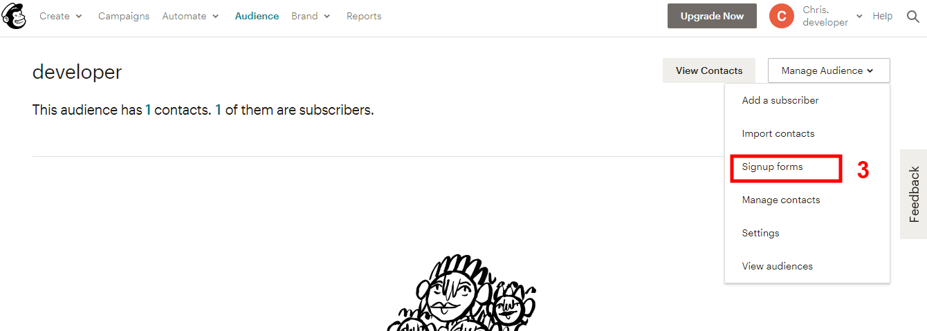
-
Click Embed forms
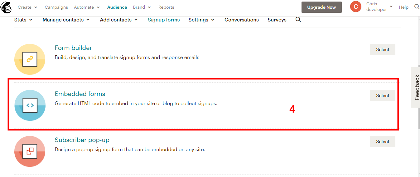
-
Copy the code and paste it to some code editor (like Notepad, TextEditor ...)
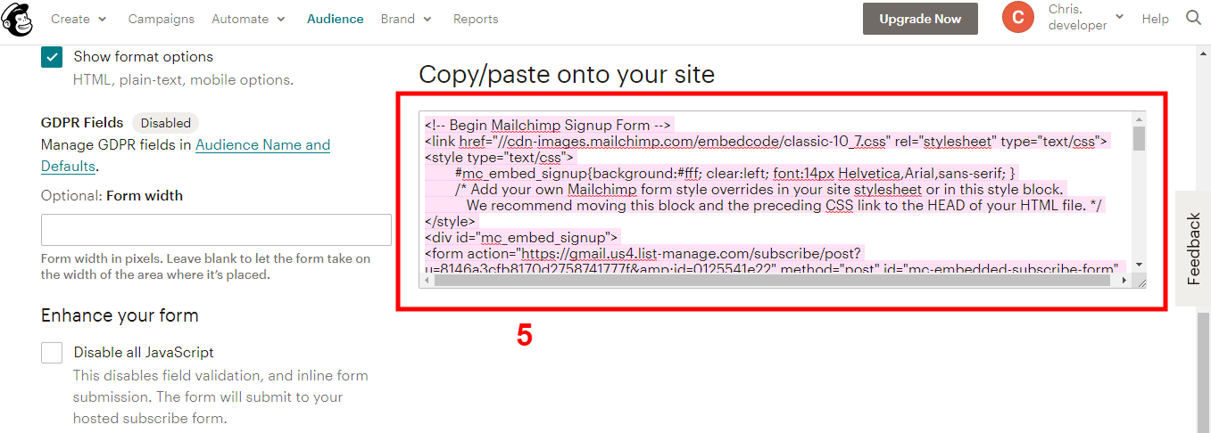
-
Copy the action URL from the code
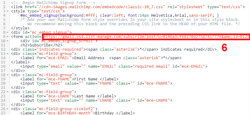
Now you have the action URL in your clipboard, just paste it to the place you need.
Is there a place to compare between RoarTheme's Templates?
Is there a place to compare between RoarTheme's Templates?
Sure! You can check the Supported Extensions here, and Supported Apps here
You can also check the full list of templates by RoarTheme
Get your Purchase Code from ThemeForest
Get your Purchase Code from ThemeForest
Themeforest provides you with a purchase code for each item you purchase. This purchase code is used for verification so you can receive theme support and also fully register your product. Please read below for instructions on how to download your purchase code.
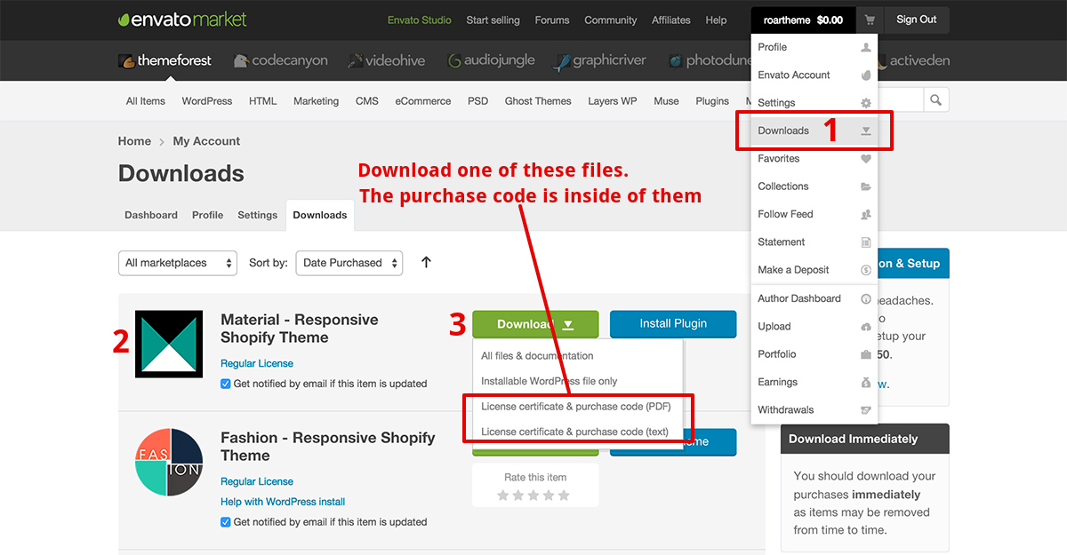
- Log into your ThemeForest account and click your username in the top right corner to access the dropdown. Select the Downloads link.
- Find the purchase in the list of items you have bought.
- Click the Download button to activate the dropdown menu. Select to download the license certificate and purchase code as a PDF or Text file. Open the file to find the purchase code. Example Purchase Code:
91d36x28-ddd5-4q70-a109-c9wc8aac6a16
Get your Instagram Access Token
Get your Instagram Access Token
You can get your Instagram Access Token by using this tool
Setup Color Swatches for custom colors?
Setup Color Swatches for custom colors?
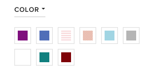
If you want to setup swatches for custom colors, like this:
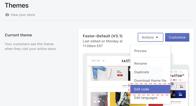
In your store admin, go to Themes section then navigate to Edit code
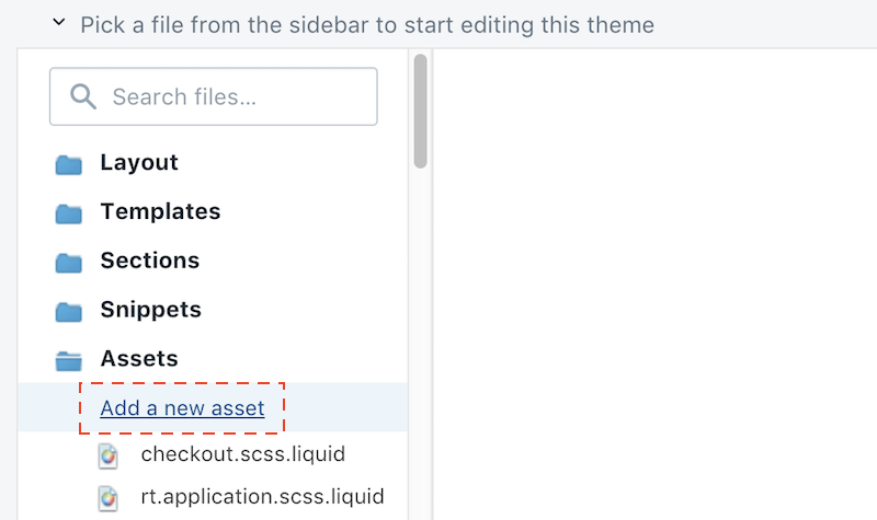
Please upload an image (50x50 pixels, PNG format) with the color you want into Assets
Please note that the image file name must match the color:
- For example, if you have a color called Burgundy, then name your image
burgundy.png(all characters must be in lower case) - If you have a color called Déjà Vu Blue, then name your image
deja-vu-blue.png - Other example, if your color is Blue/Gray, then name your image
blue-gray.png - Most simple example, if your color is Black, the name your image
black.png
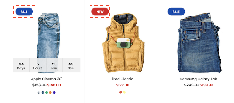
Display SALE and NEW labels
Display SALE and NEW labels
-
To activate NEW label for a product, in the product admin, add a tag named
latest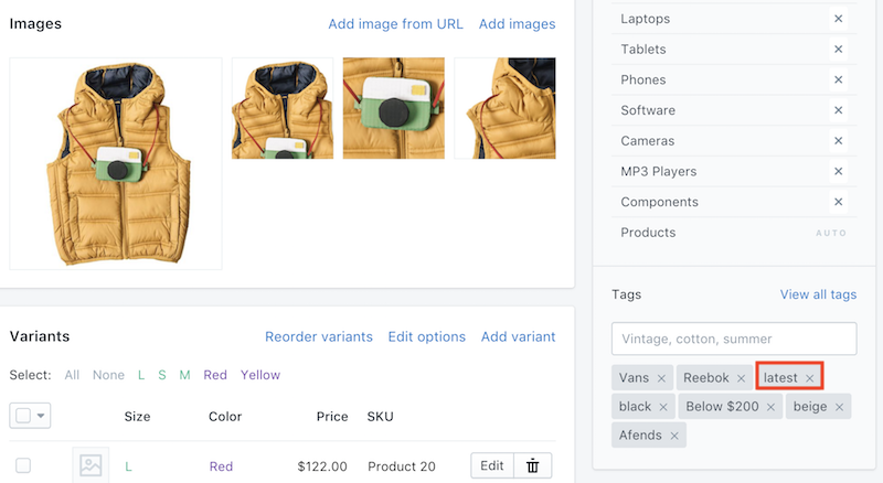
-
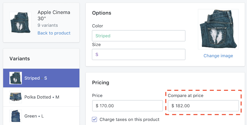
The SALE label is active automatically when a product has Compare at Price
Choose between Full-Width vs. Boxed Design Layouts
Choose between Full-Width vs. Boxed Design Layouts
When it comes to website design, the way you lay out the elements on a page makes a big difference for user experience. Two of the most popular styles of layouts are full-width and boxed design. Each web design style has its own list of advantages and disadvantages, as highlighted below.
In order to figure out which type of design is right for your website, you have to weigh the pros and cons of each website design and understand how each would fit the purpose of your website.
Full-Width Design
-
Advantages Full-width web designs flow nicely because many elements, such as columns and sidebars, are the same width (straightforward enough, right?). Main content areas, however, change width, which allows images and text to flow to different areas of the webpage. A brochure site tends to benefit from a fixed width because the site adapts to browser size.
-
Disadvantages One disadvantage of this type of web design is that designers need a lot of experience to master this type of website. They have to vary widths of photos and videos to make sure they look good on every type of screen they’re viewed on. This type of website looks good on mobile phones, tablets and computers, so whichever way consumers reach the website they’ll have a visually positive experience.
Boxed Design Layouts
-
Advantages Boxed layouts offer the same widths for everything on the page. Boxed designs are clean and provide a uniform website design that suits many different purposes. One of the biggest advantages is that it can be viewed at different screen resolutions without destroying the quality and readability of the layout. Boxed designs simplify the user experience and guide users on where they need to go.
-
Disadvantages A disadvantage of this type of website design is that boxed layouts tend to allow either too much or too little white space depending on the size of the screen. Although information is readable, it may gather in the middle of the page or hang off the page, creating a negative visual experience for the user. That’s why it’s important to know how your visitors access your site and from what types of devices (i.e. on a computer or a mobile device).
Which Web Design Layout is Best for You?
Determining how to lay out your website depends heavily on the overall message you’re trying to convey with your website design, the type of media you’re including on your site, and whether or not you want the site to be mobile friendly. Once you’ve read about the advantages and disadvantages of each, it’s time to choose between the two. The nice thing about website design is that if a certain layout ends up not working for what you need, it is possible to rebuild your website the way you want it to be, although it will take some time and work.